Practice Project: Exploring Socioeconomic Trends in US Counties
Estimated time needed: 60 minutes
Required software
You can complete this lab using the free Tableau Public online platform or the Tableau Desktop (Public Edition) app.
About the data set
This data set, derived from the American Community Survey (ACS) conducted by the U.S. Census Bureau in 2017, provides demographic and socioeconomic information at the county level. It offers valuable insights into the population characteristics, economic activity, and commuting patterns across various counties in the United States. This public data set is available on the Kaggle website as US Census Demographic Data under the CC0: Public Domain license. The primary data set was retrieved from the website.
Hold the CTRL key while you click to download each of the following files:
These data sets have 37 fields, 3220 rows, and 37 fields, 74001 rows, respectively.
Key variables
Geographic identifiers
- CountyID: Unique identifier for each county.
- State: State abbreviation for the county's location.
- County: Name of the county.
Demographic data
- TotalPop: Total population of the county.
- Men, Women: Number of males and females residing in the county.
- Hispanic, White, Black, Native, Asian, Pacific: Population distribution based on different ethnicities and races.
- VotingAgeCitizen: Number of citizens eligible to vote in the county.
Economic data
- Income: Median household income.
- IncomeErr: Margin of error for the median household income.
- IncomePerCap: Per capita income.
- IncomePerCapErr: Margin of error for the per capita income.
- Poverty: Percentage of the population living below the poverty line.
- ChildPoverty: Percentage of children living below the poverty line.
Occupation and industry data
- Professional, Service, Office, Construction, Production: Percentage of the employed population in various occupational categories.
Commuting data
- Drive, Carpool, Transit, Walk, OtherTransp: Percentage of workers using different commuting methods.
- WorkAtHome: Percentage of workers who work from home.
- MeanCommute: Average commute time in minutes.
Employment data
- Employed: Total number of employed individuals.
- PrivateWork, PublicWork: Number of individuals employed in private and public sectors, respectively.
- SelfEmployed: Number of self-employed individuals.
- FamilyWork: Number of individuals working in their family business.
- Unemployed: Number of unemployed individuals.
The following two data sets are used for data modeling.
- acs2017_census_tract_data.csv: Data for each census tract in the US, including DC and Puerto Rico.
- acs2017_county_data.csv: Data for each county or county equivalent in the US, including DC and Puerto Rico.
The two files have the same structure, with just a small difference in the name of the id column. Counties are political subdivisions, and the boundaries of some have been set for centuries. Census tracts, however, are defined by the census bureau and will have a much more consistent size. A typical census tract has around 5000 or so residents.
Task descriptions for the project:
Task 1: Building hierarchies
1.1 Create a hierarchy named Geographic Hierarchy using County and State.
Task 2: Simple data modeling
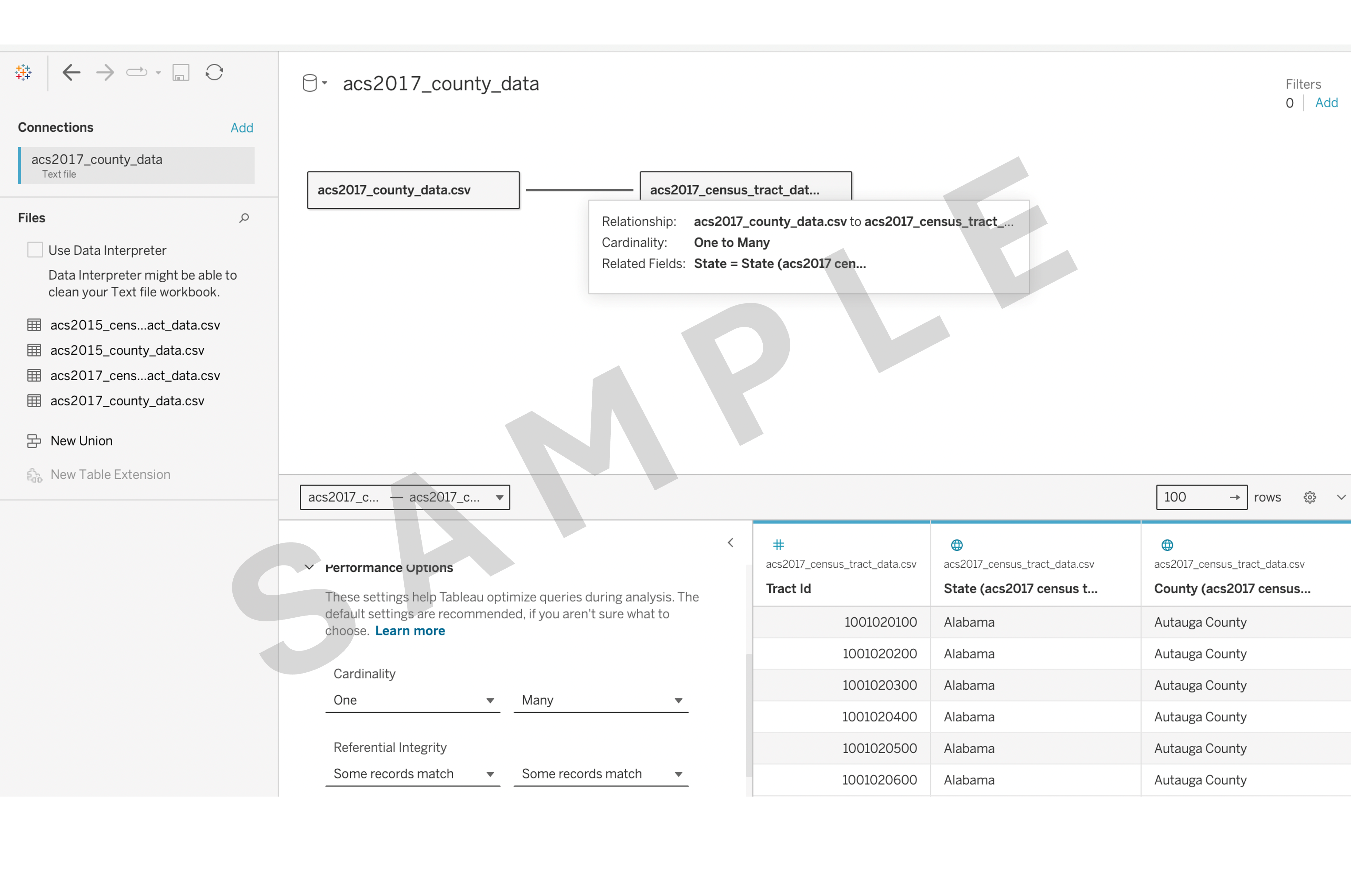
2.1 Build one-to-many relationships with acs2017_county_data.csv and acs2017_census_tract_data.csv.
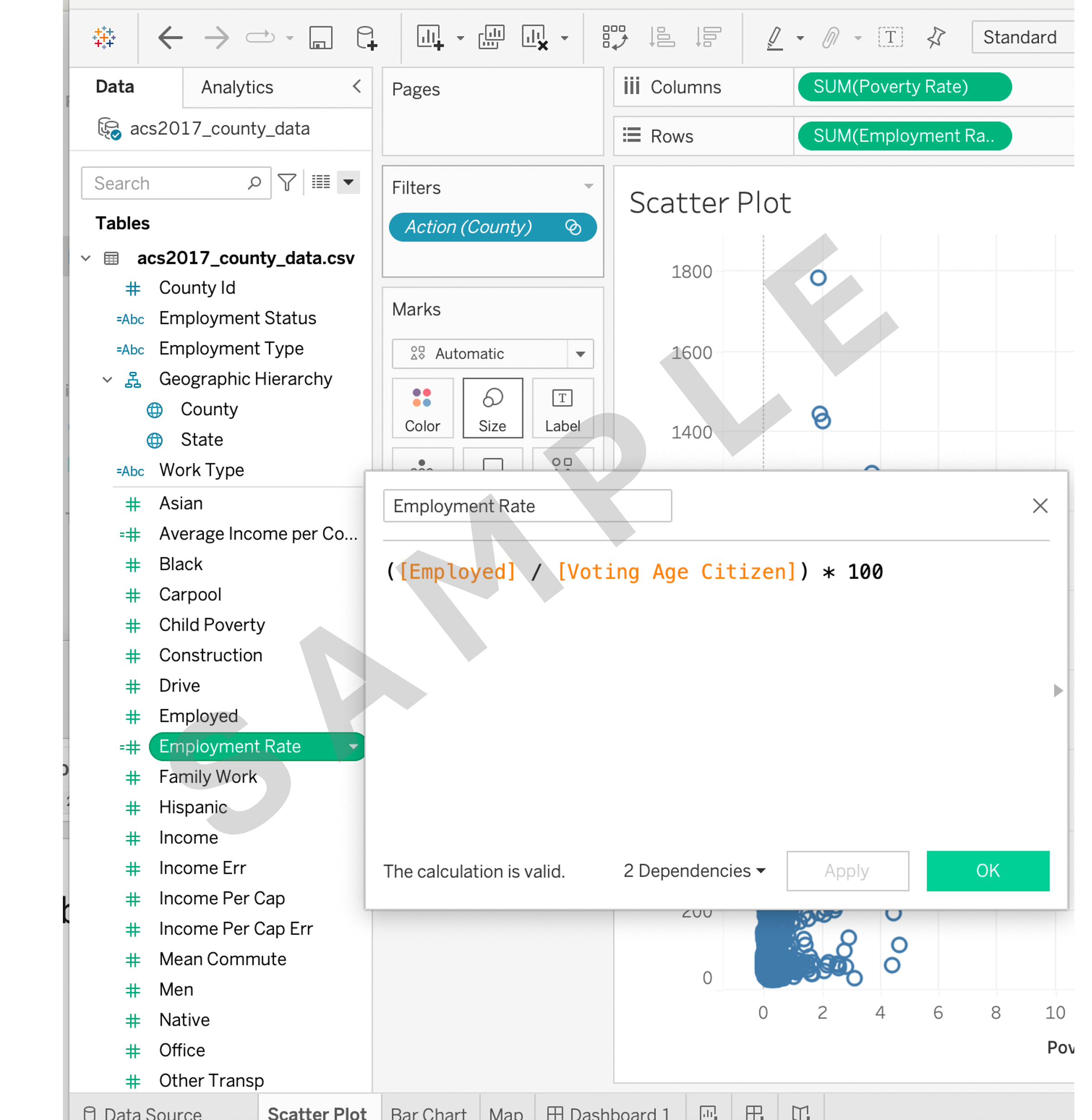
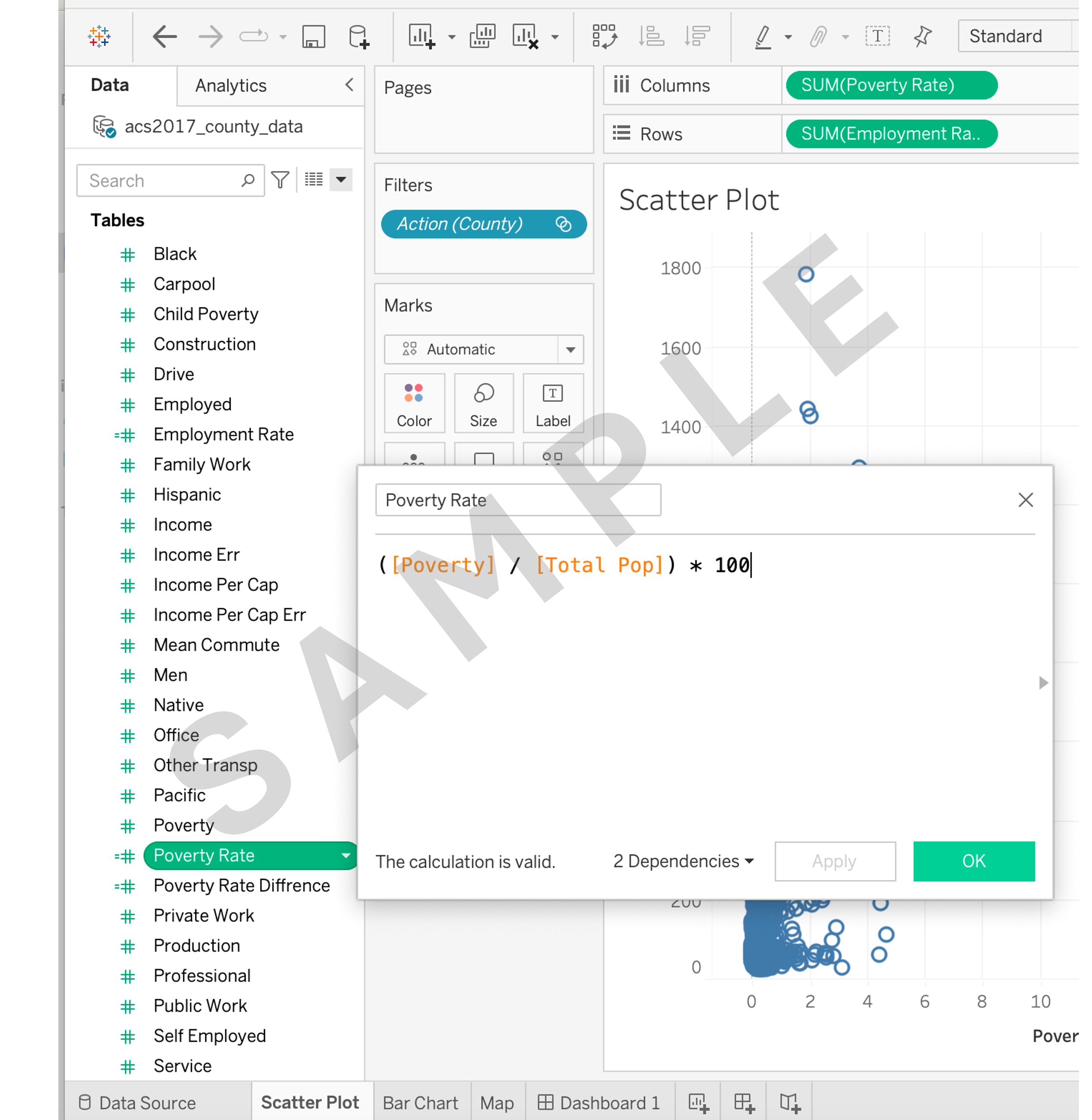
2.2 a) Calculate a new field named Employment Rate’ by dividing Employed by Voting Age Citizen and multiplying by 100.
2.2 b) Calculate a new field named Poverty Rate by dividing Poverty by Total Pop and multiplying by 100.
Task 3: Creating basic visualizations
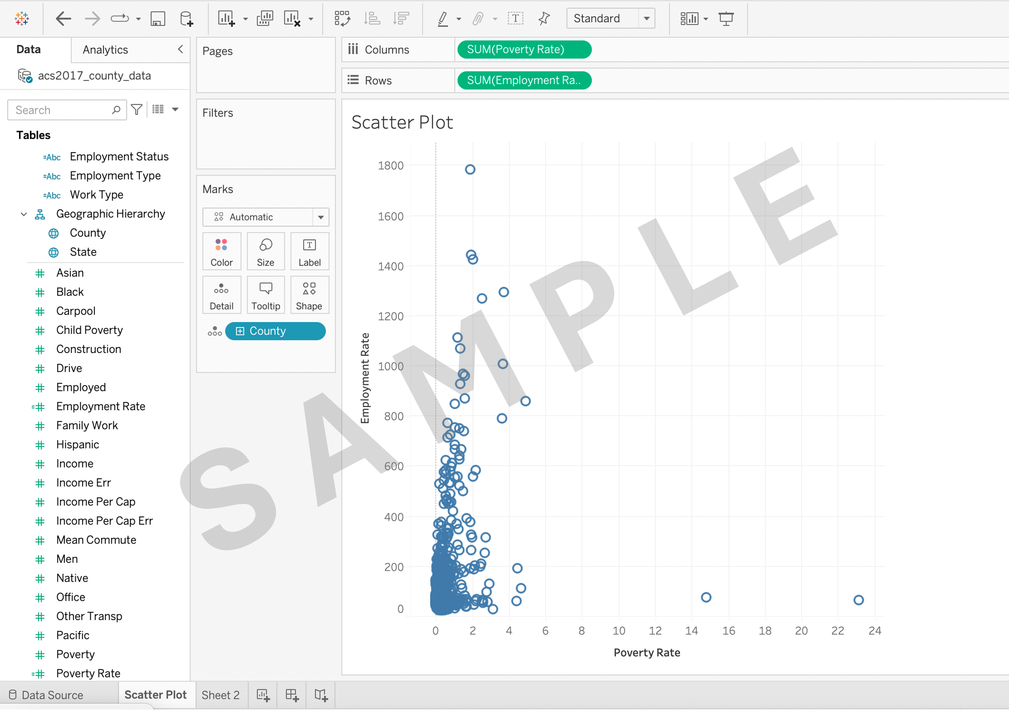
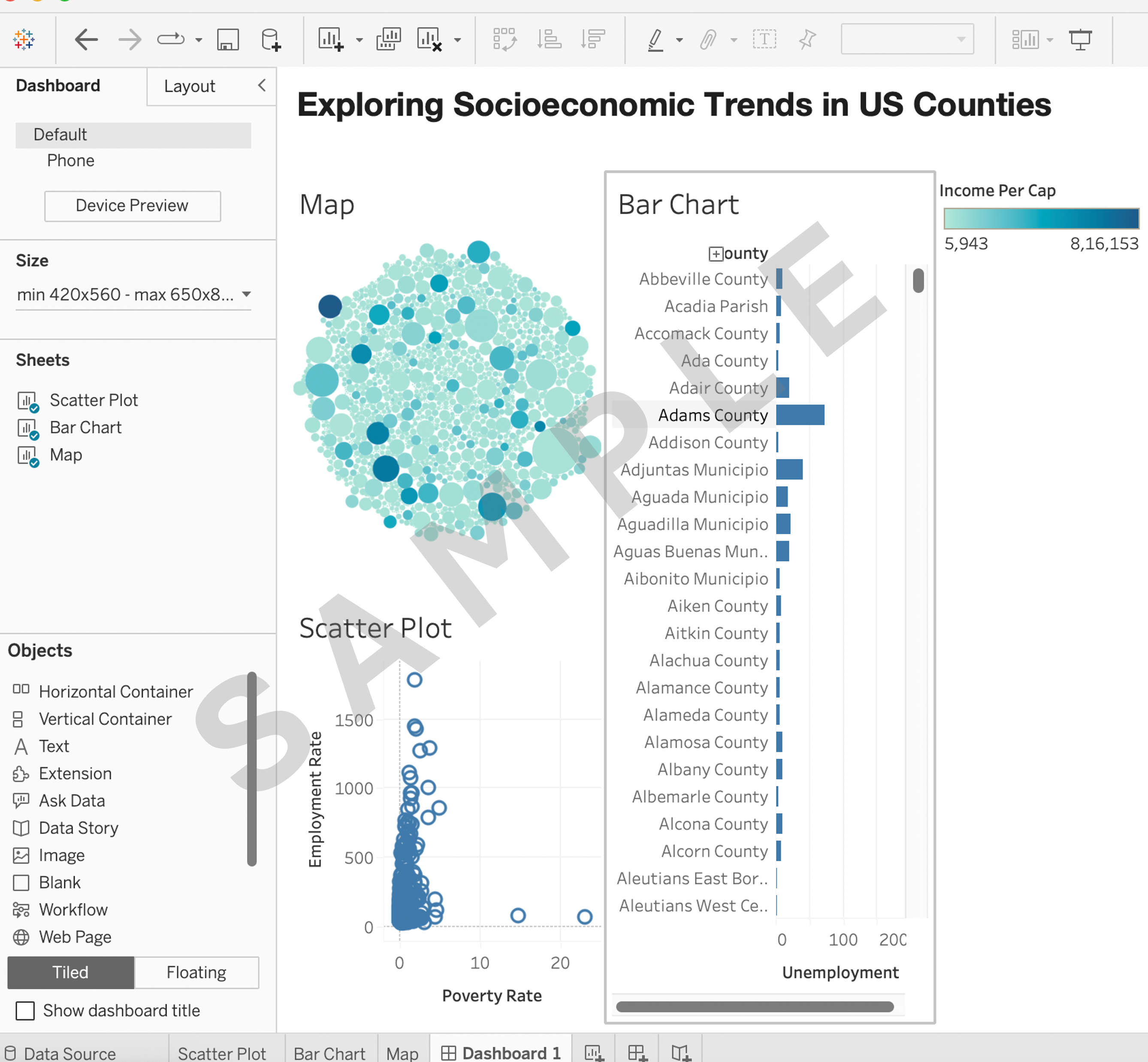
3.1 Create a scatter plot to visualize the relationship between Employment Rate and Poverty Rate.
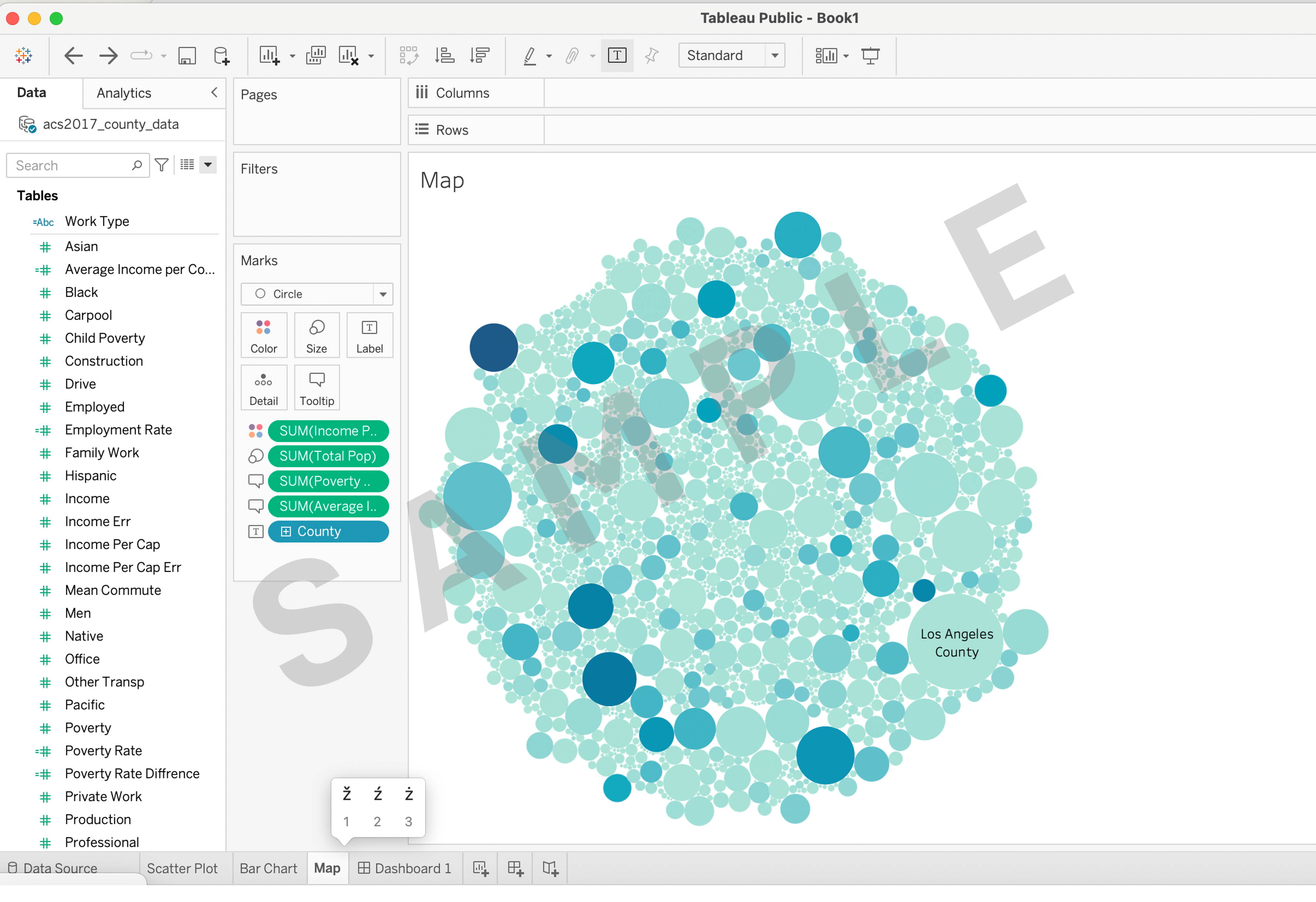
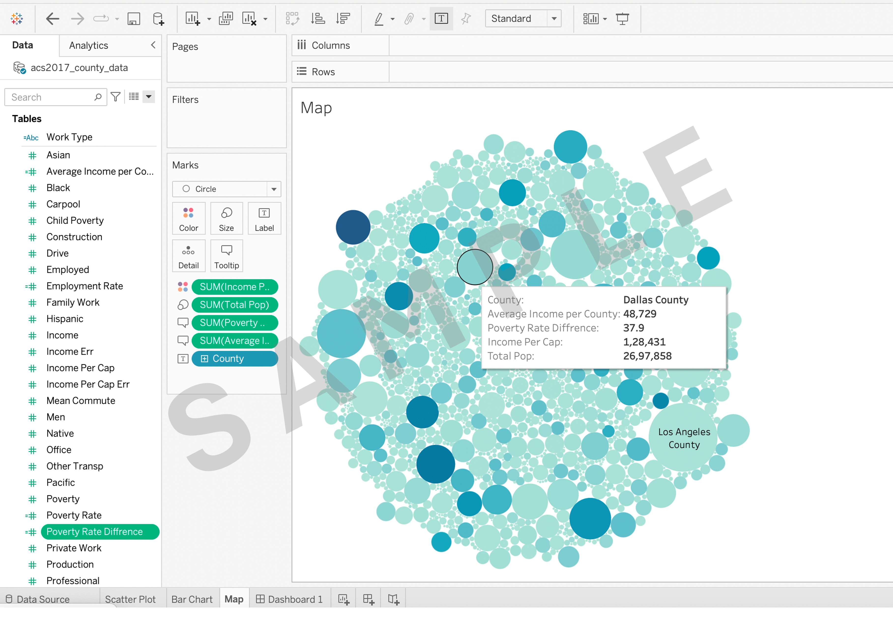
3.2 Create a packed bubble map using Geographic Hierarchy and Total Pop.
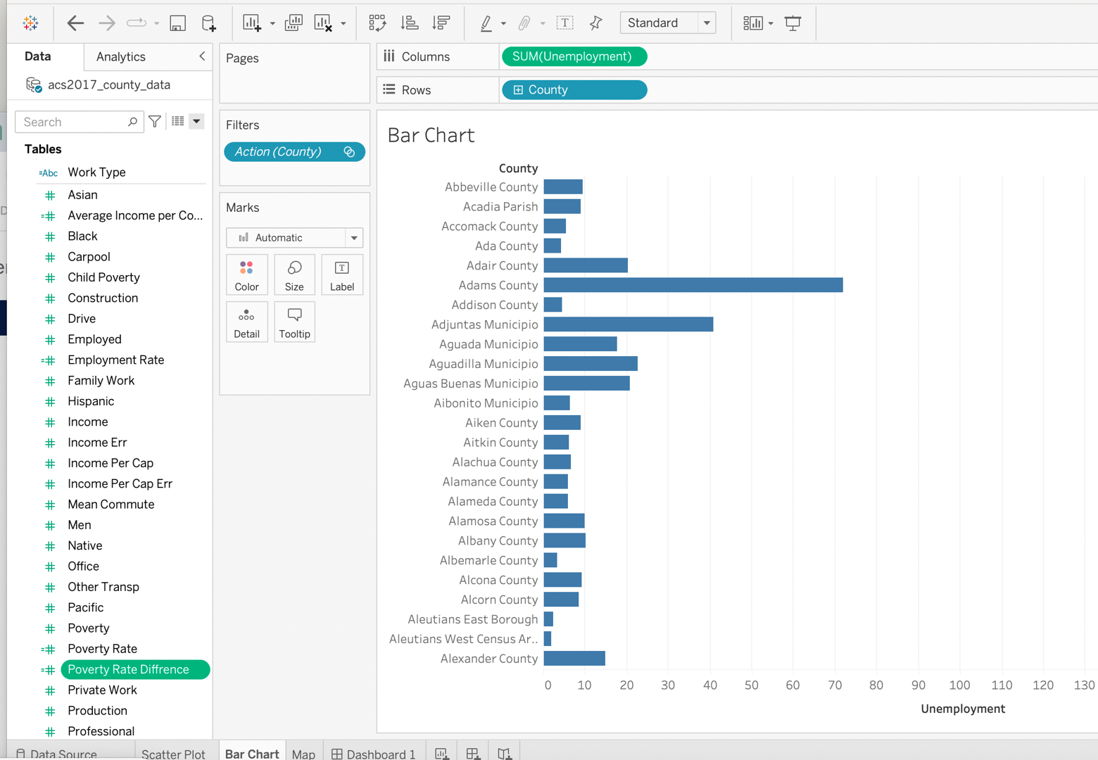
3.3 Create a bar chart to compare Unemployment across Geographic Hierarchy.
Task 4: Create LOD and complex calculations (with calculated fields)
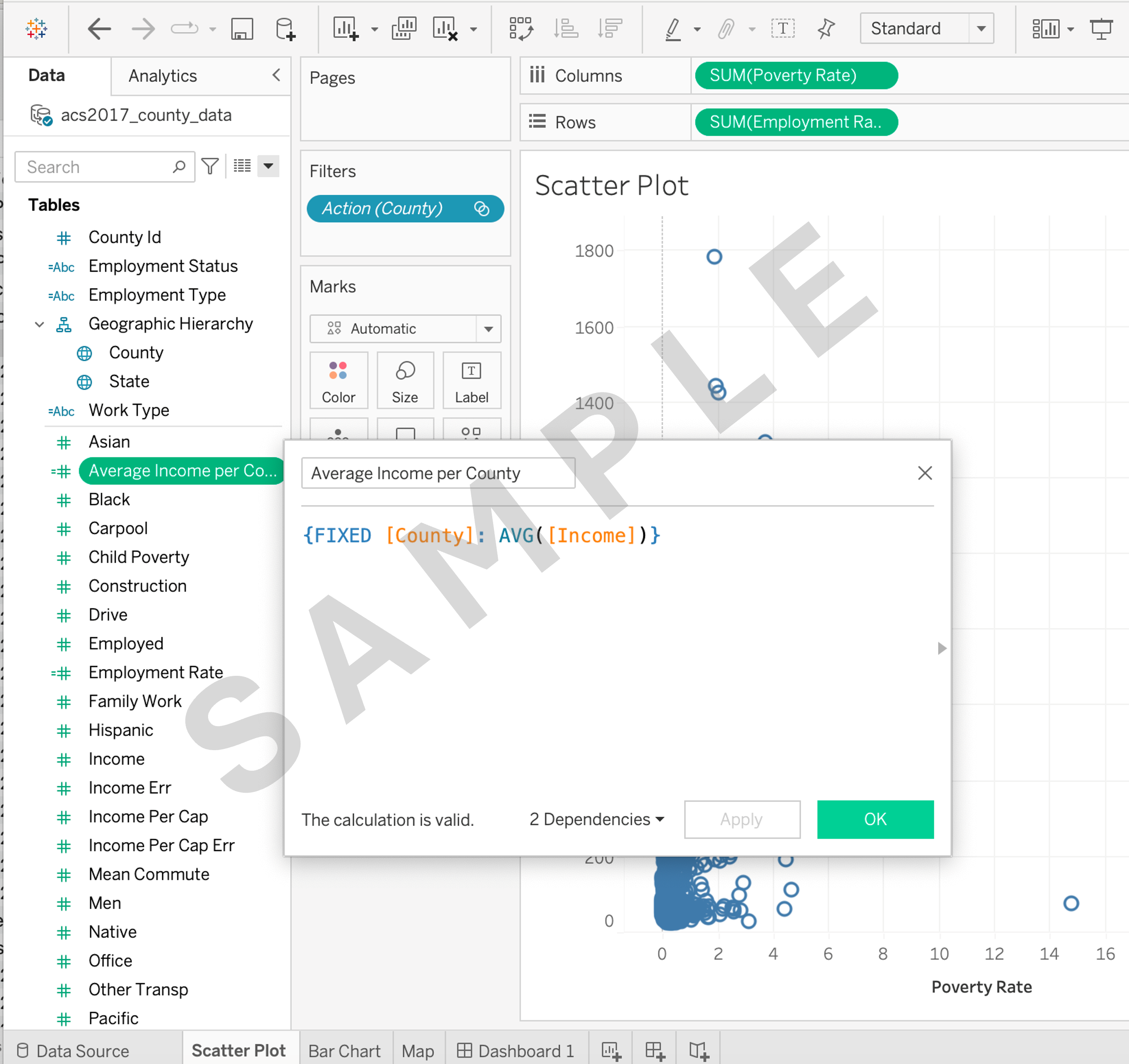
4.1 Create a calculated field named Average Income per County using Level of Detail (LOD) calculations.
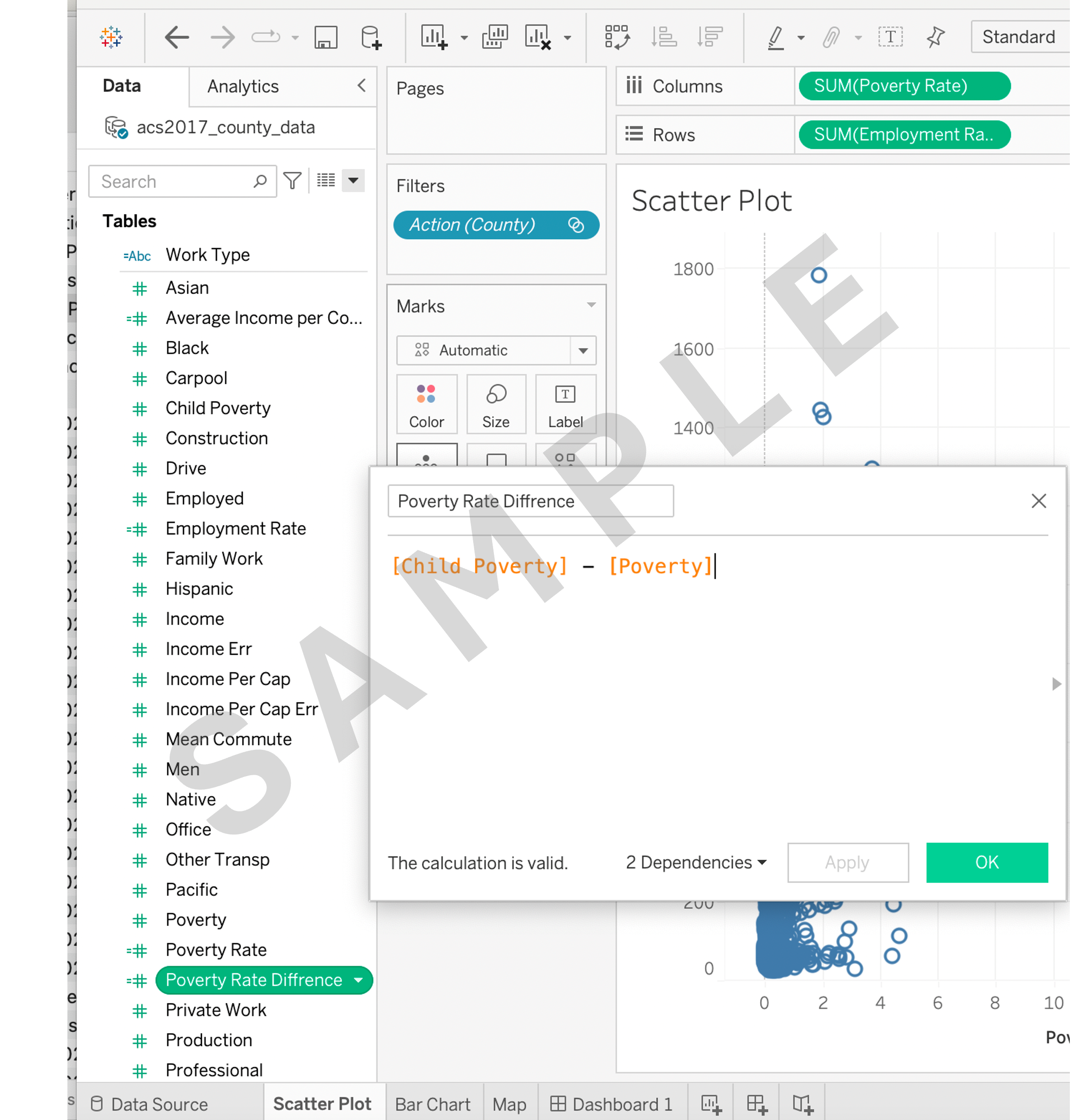
4.2 Create a calculated field named Poverty rate difference by subtracting Poverty from Child Poverty.
Task 5: Using tooltips
5.1 Enhance your map visualizations by adding tooltips that display additional information on hover, such as Average Income per County, Poverty rate difference, and Income per capita.
Task 6: Creating a final dashboard
6.1 Create a dashboard and arrange the created visualizations (scatter plot, map and bar chart) and calculated fields into a visually appealing and informative dashboard.
Task 7: Implementing dashboard actions
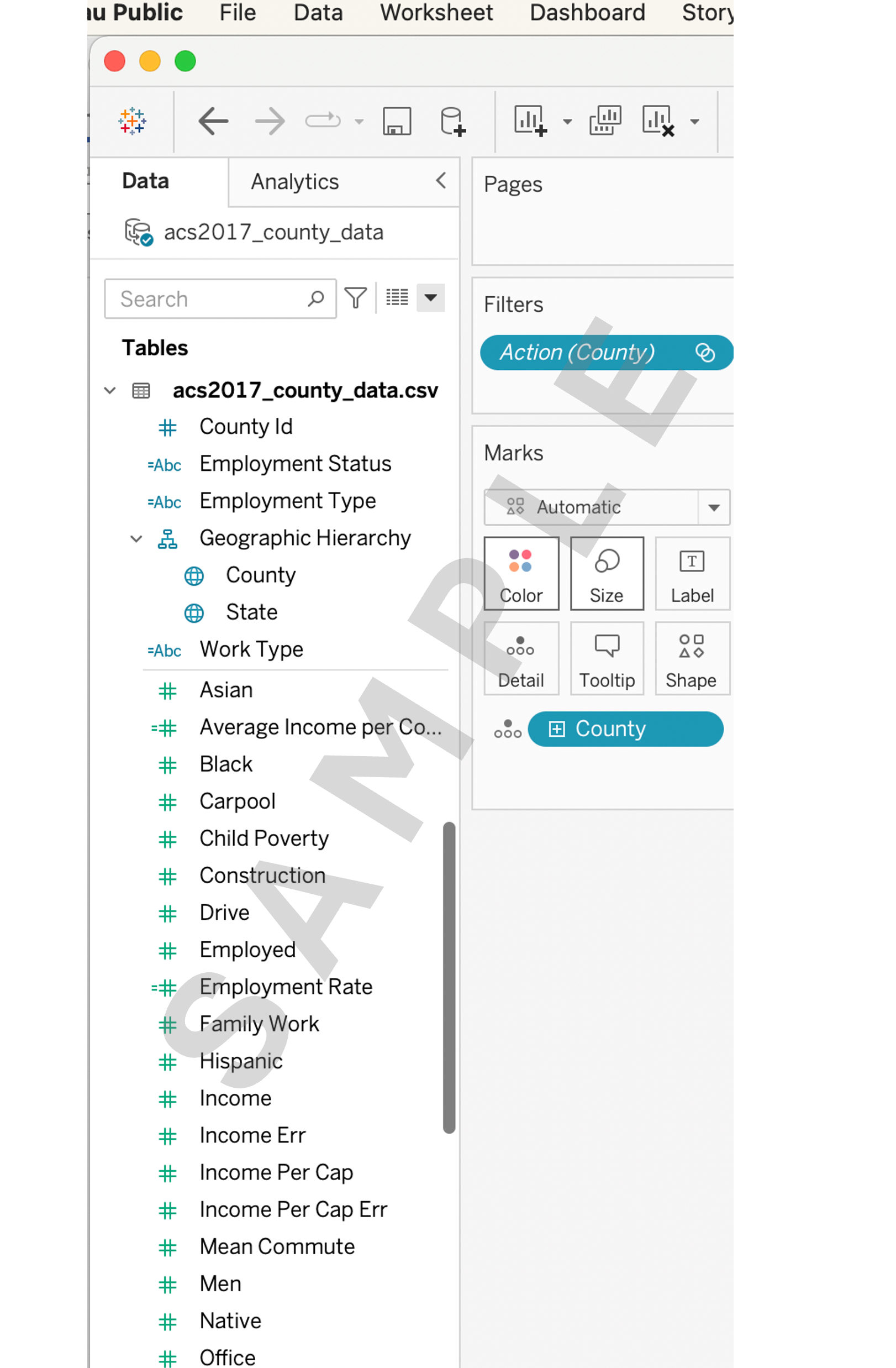
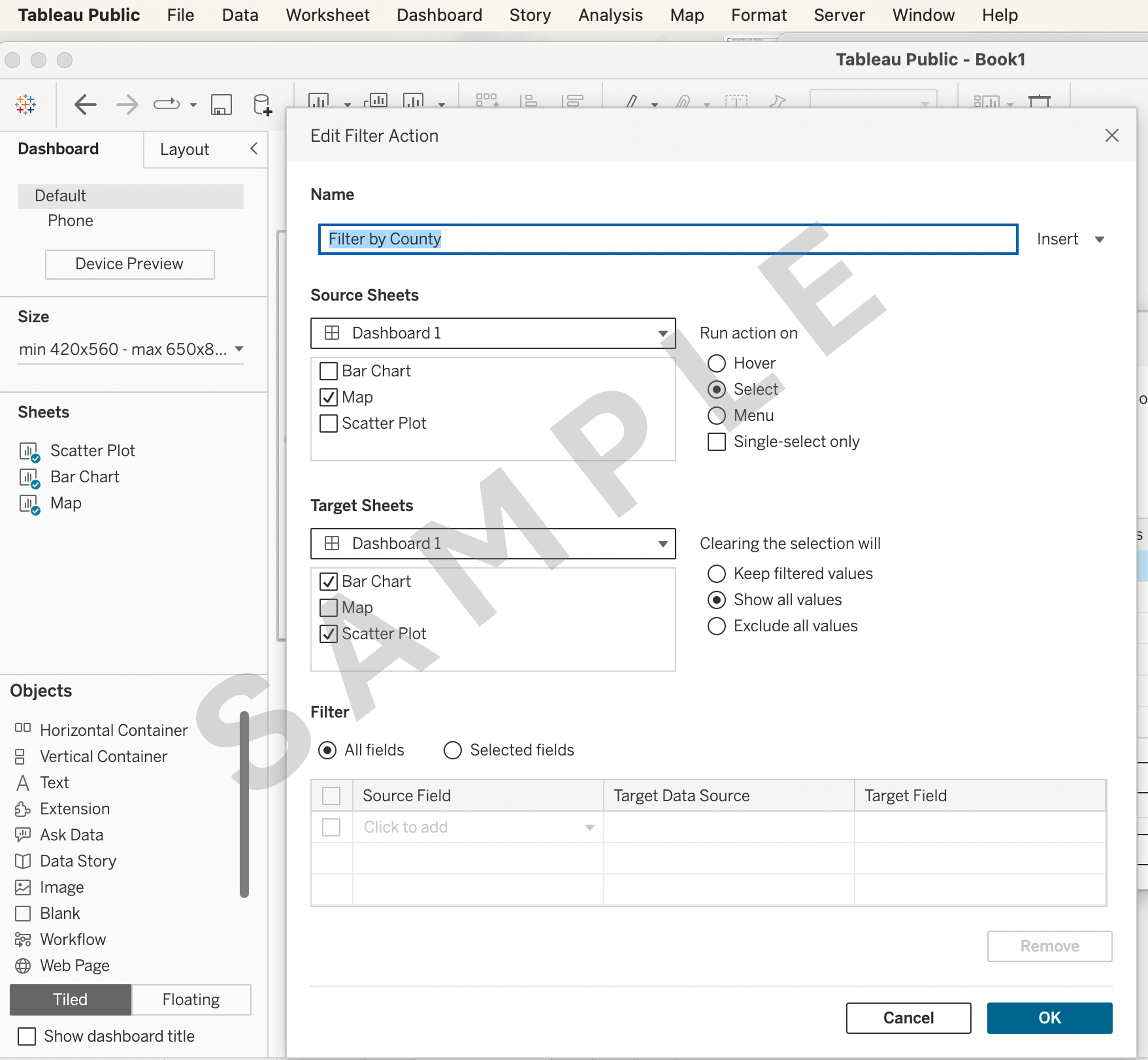
7.1 Create a filter action that allows users to select a specific County on the map and see the county's corresponding scatter plot and bar chart.
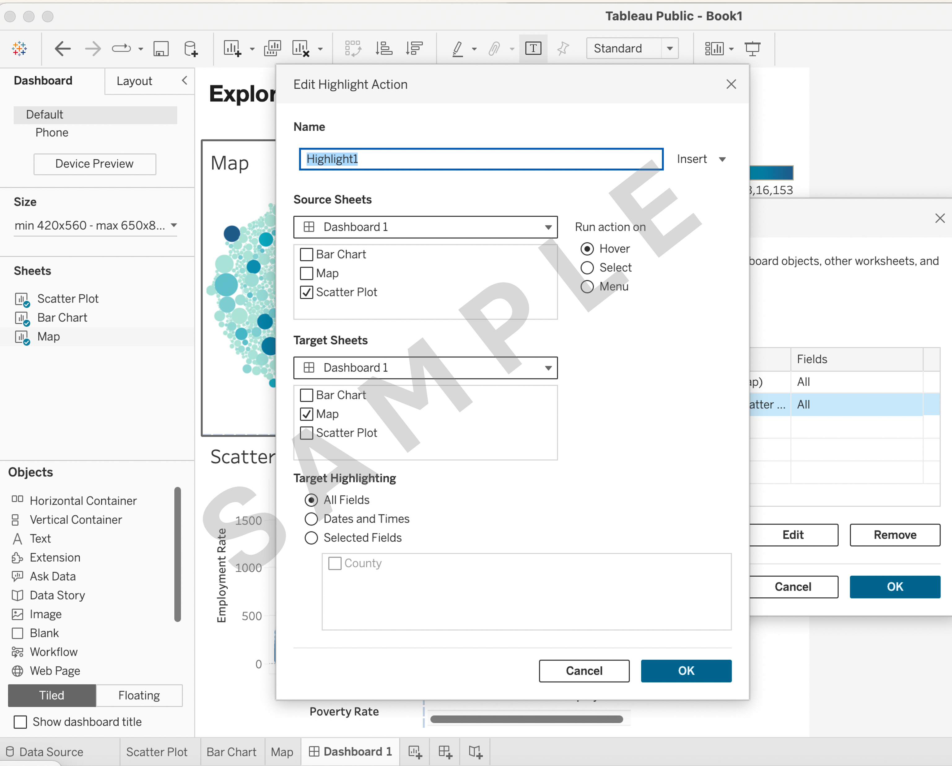
7.2 Implement a highlight action that emphasizes listings of a specific County in the Map when hovering on a Scatter Plot.